Autohaus Maschler
Rebranding and definition of the brand design in form of a guideline for employees and creatives.
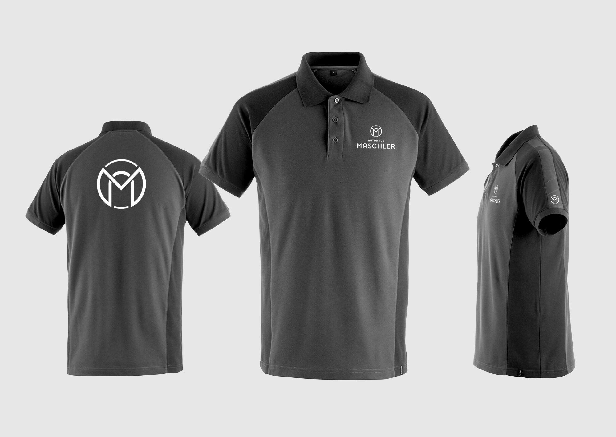
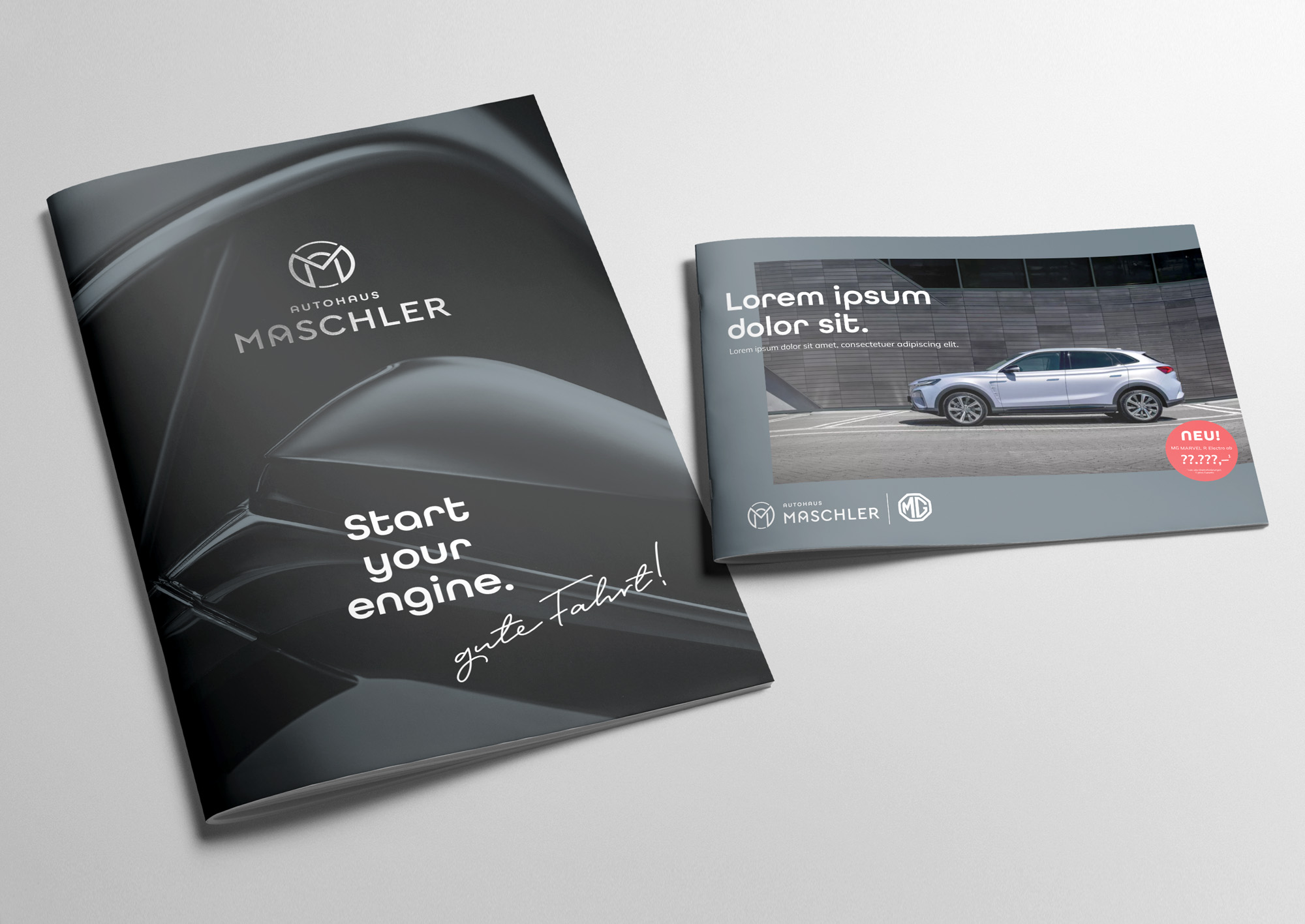
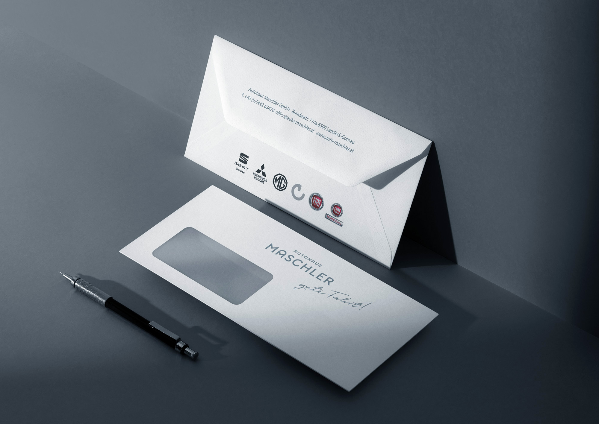
It was the goal to incorporate the initials of the name, as well as the circle symbolizing the wheel of a car as a link to the trade of Autohaus Maschler into the logo. As an additional style element, the old claim was redesigned to fit into the new corporate design. The color palette was predetermined, but shifted slightly into a modern appearance and adding silver as an accent color for special applications. The font choice was inspired by an old image of the workshop from the 70s.
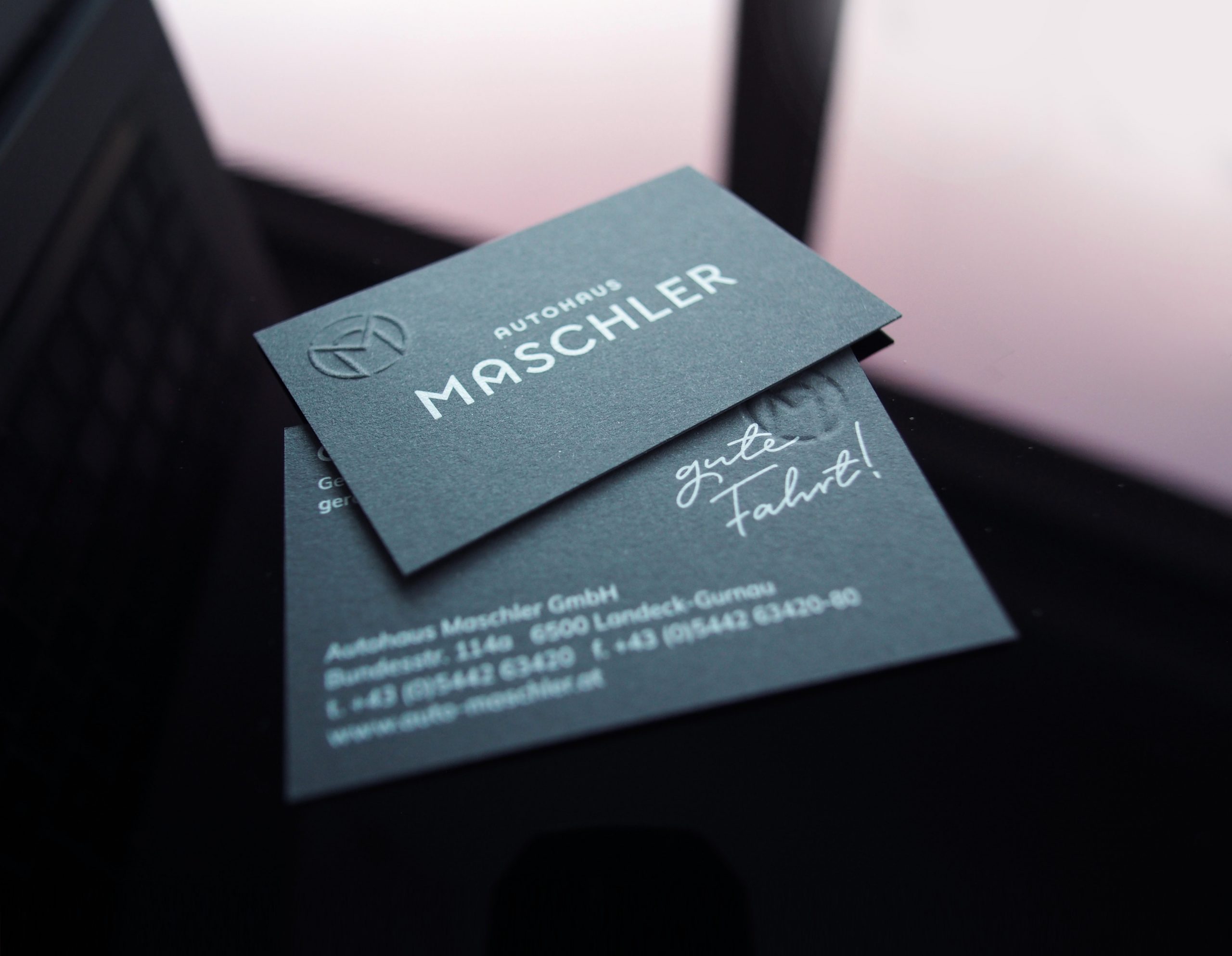
Part of the stationary package are the business cards printed white on “Metapaper Colors Anthracite” with an embossing of the monogram.
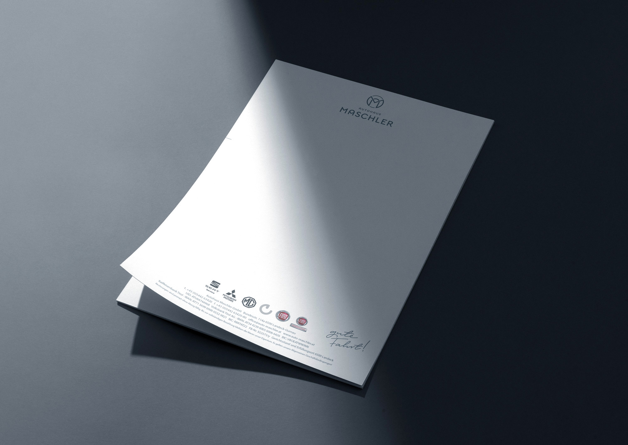
The corporate design guideline includes examples of the design in use. It helps creatives and employees to understand the basic principles of the corporate design.