inKontakt
Logo and brand design as well as stationary and screendesign.
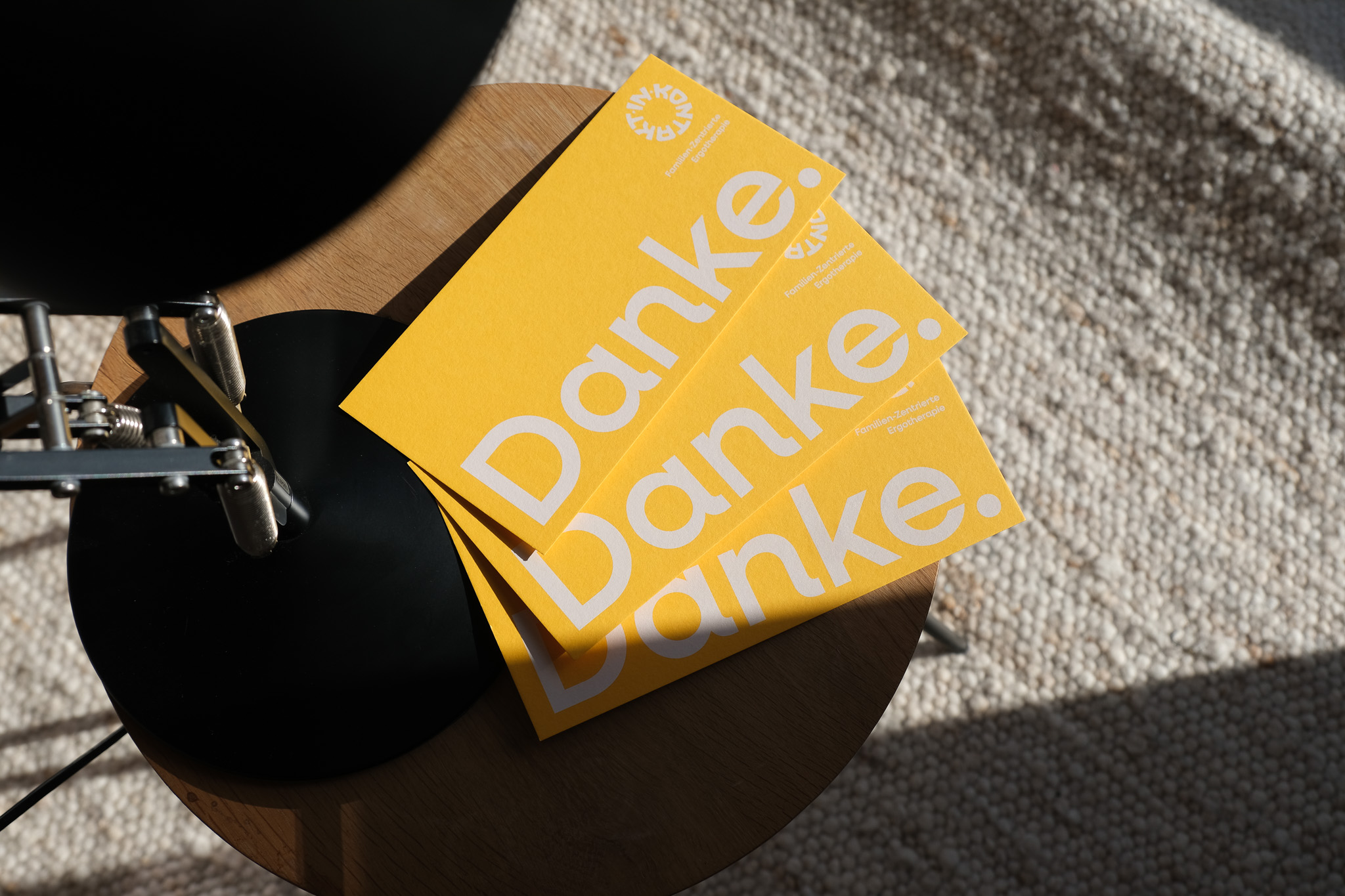
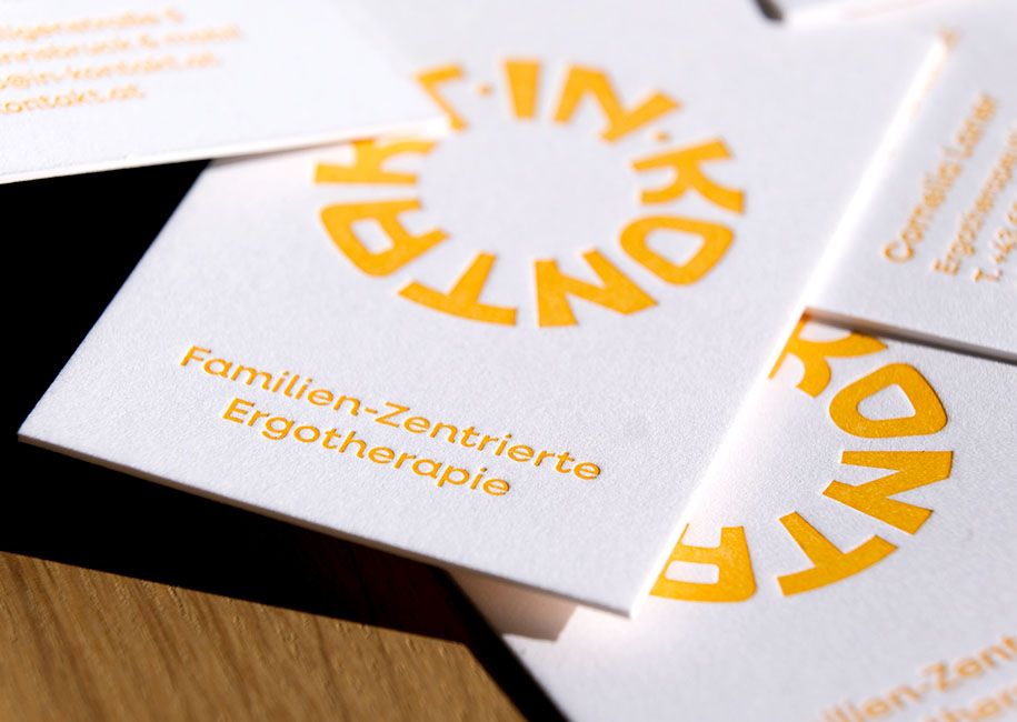
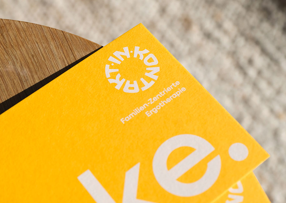
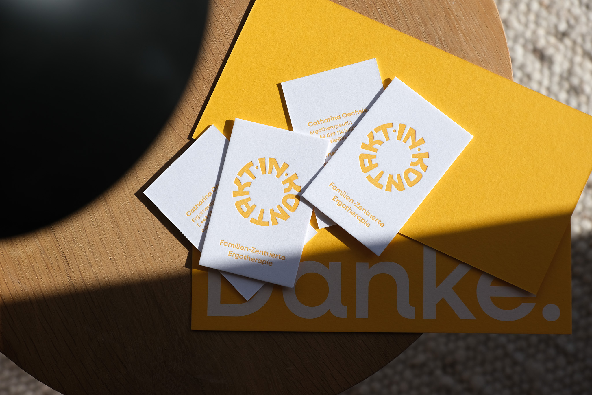
Two occupational therapists came to me for a visual identity. The idea was to bring the idea of “to be in contact” into the communication as well as the stationary. We decided to use thick cardboard with letterpress embossing to create the physical connection between sender and recipient through a haptic sensation. The logo also symbolizes this “endless connection” as it stays in infinite contact with itself.
inKontakt.